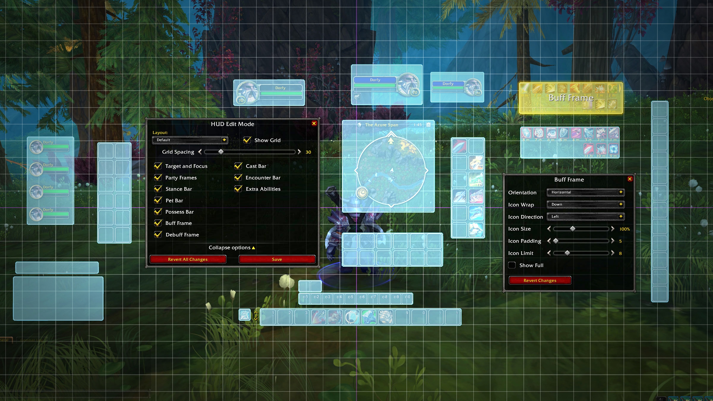
Get ready for a customizable HUD and UI designed to be effective, attractive, and easily accessible.
Looking good!
Nice. I mean it took so long to revamp it but I guess that’s what happens when you rely on addons for everything.
Please don’t forget the unit frames! The ones on the initial screenshots look way more modern than the current ones. Please don’t forget to refresh them. Thanks
I’m so excited about this ![]()
Someone from the UI dept. finally played FFXIV, good for them.
I have my Bartender and IceHUD, had them for ages. I will try it though, just to see if I can get something I like out of it.
One thing that would be nice is if people logging on wouldn’t overlap the healing frames, i prefer healing without addons
Then John logs on and you accidently click to whisper him instead of targetting whoever you ment to target
and yes i have reported this as a bug
post edited
Proceeds to place everything exactly in the same place but slightly bigger
I’d really like the ability to make it so enemy name plates change colour depending on aggro.
If that was implemented I wouldn’t need any addon’s for core gameplay.
(I’d still use Dynamic-cam and Immersion quest text as a preference)
Took a while, huh.
Fixes to the guild roster, guild recruitment interface and improvements to the calendar are also sorely needed, while you’re at it ![]()
You can do that in current client.
Will there be an integrated dps/heal meters?
As someone who doesn’t use addons, this is a welcome change
Yes. And? My statement stands.
Looks good, going to have a play later - have run the beta (just to see if it works) and the settings interface has changed as well - seems a bit cluttered (quality settings mainly) to me though.
It’s a welcoming change but after 16 years spent playing with the original UI I don’t know if I ever change (most likely yes)
Bags absolutely not! They’ll stay separate, I already struggle to find things when are divided let alone when they’re all in one massive bag ![]()


