Please stop, making wow retail zone graphics, look more and more like an aquarel painting. It looks really bad and not appealing. Who ever thought this was a good idea, is mistaken. The new maps and zones look mostly flat aswell (except the huge mountain overcompensation), and not immersive anymore either. They are slowly trying to integrate more and more this aquarel into the old zones aswell, actively taking away their immersive experience.
It’s the first time in 20 years I am considering not buying an xpack, simply because of the new design in graphics. I know, nobody cares on the forum. But the empty player maps in retail do. This blizzard obsession with anti-clunky gameplay, spells and smoothing everything in wow since years, ruins a lot aswell… It also takes away from that special appeal, wow used to have compared to other mmo’s. Ruined gameplay, look alike class design, ruined lore, now ruined gfx… It all adds up to the overal game experience which is no longer fun compared to classic.
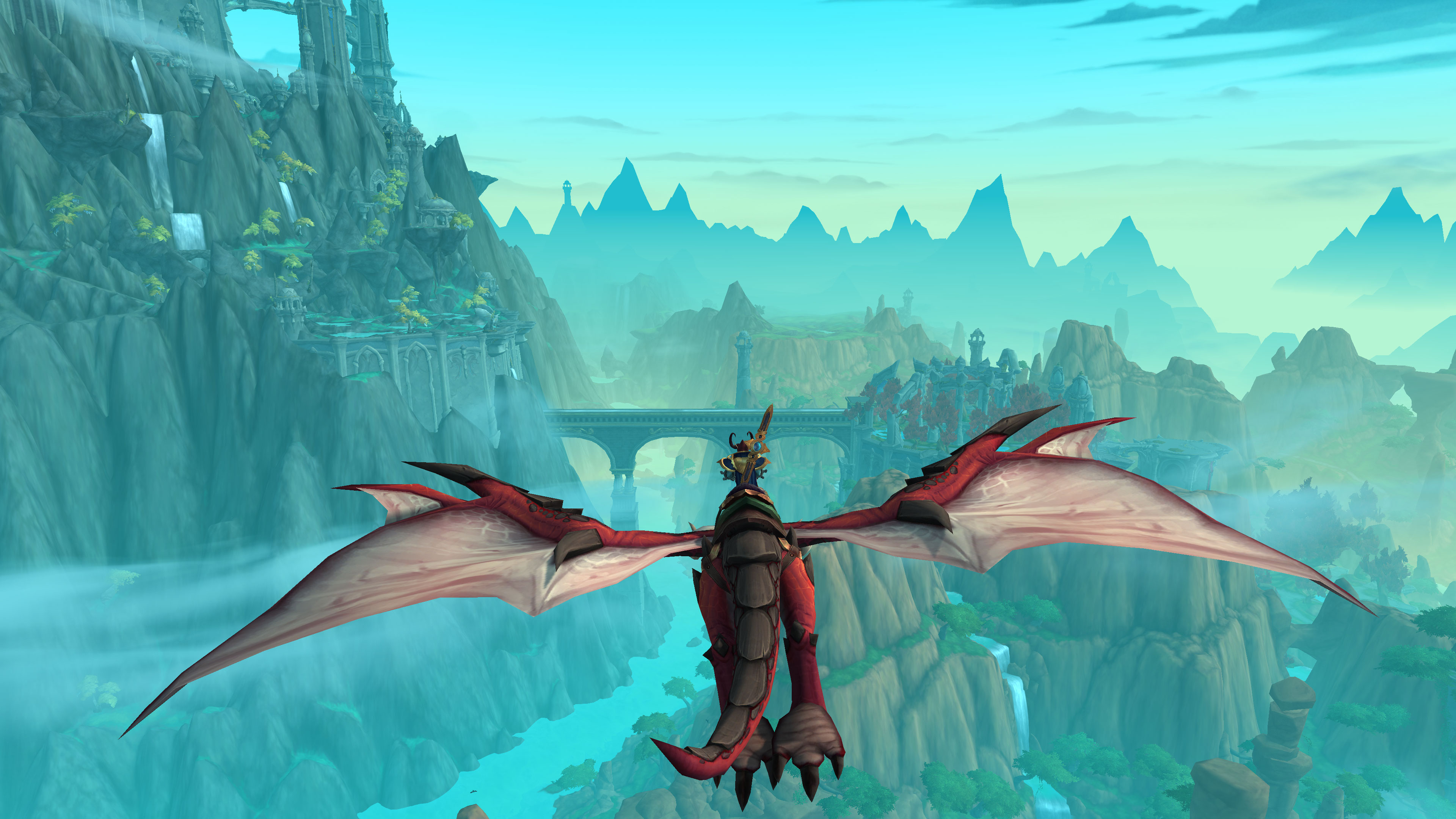
I’m not sure I see what the issue is, we have greater view distance than earlier games and I think it makes for some great screenshots.
I’m not really sure how it looks like a style of water colour paintings. The graphics have improved over time and you can really notice it going back to zones that are still pretty much as was when released.
I’m a bit lost on this complaint. That is not to say it’s not an issue for others ofc. I just don’t get it. Only the mock up art work (concept artwork), the stuff in planning looks remotely like it was painted to me.
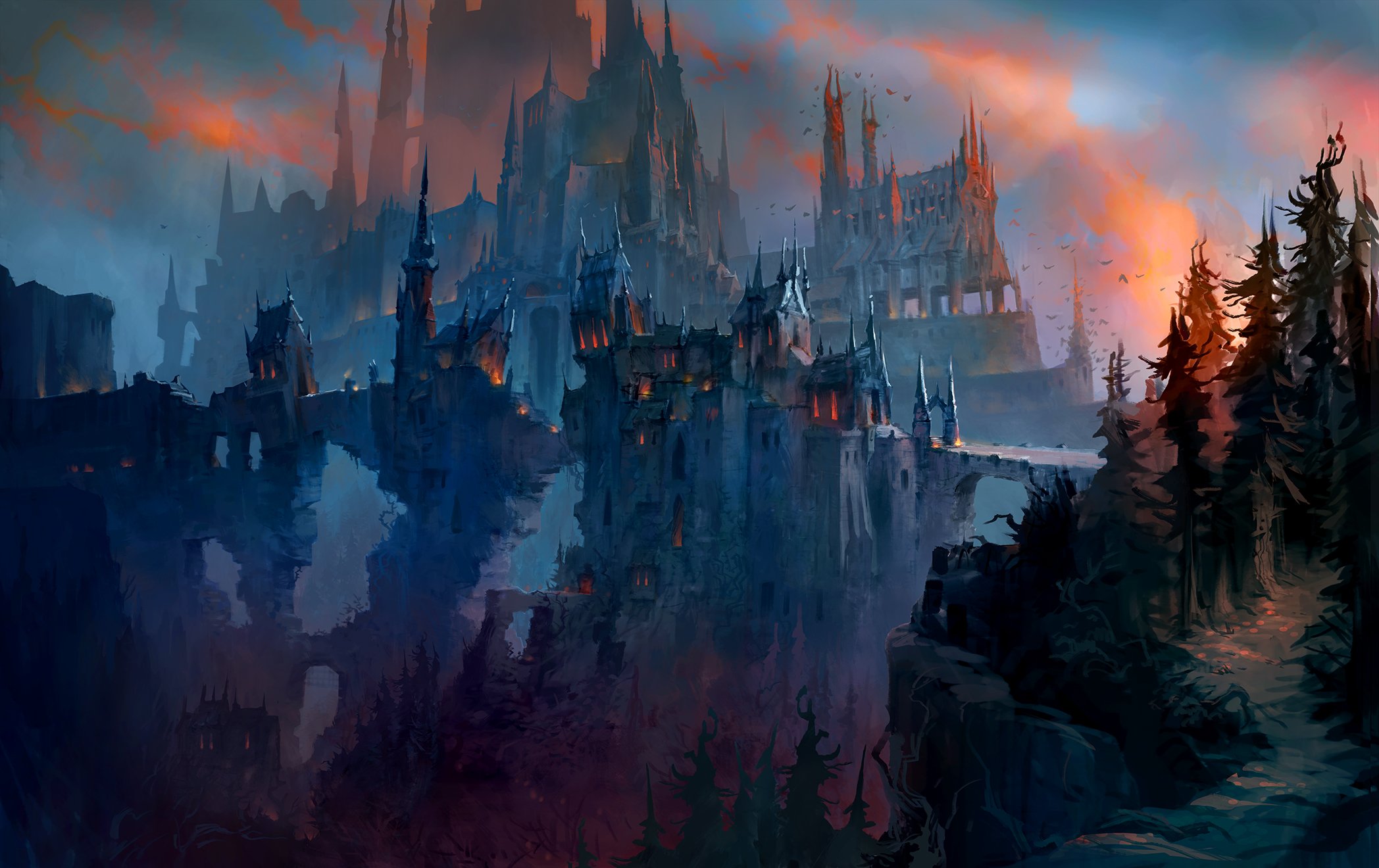
For example this was part of the Revendreth press pack. It’s a great picture, but it’s not how it looks in game but you can see how it was how they were inspired, the concept of it etc.
I understand your complaint, the expansion in quite a few places uses sort of washed out, pastel colours and it’s rather bright. I’m not a huge fan of it either, it looks quite different from what the game used to look like.
That said, another forum poster ‘saved’ my experience (thank you once again Ishayo!) for pointing out you can set your gamma to 0.9 instead of 1. It looks quite different then, more saturated. I’d give it a try and see whether that improves things for you
I agree in so far that DF expands on an artstyle we saw in Legion already, Thaldraszus reminds me of Azsuna in some ways for example. With Legion the contrast and saturation were different tho, it creates a different colour palette than the DF one which is more ‘flat’. In certain places I was reminded somewhat of FF14 in that particular sense.
I’m sorry, I simply don’t see the problem. The art team never fails imo, everywhere looks simply spectacular. Go play Classic and uhm… yeah that’s flat.
I want them to make specific music that changes with phases for atleast final raid bosses.
Its kind of no brain we needed DROP for sakareth last phase and when fyrakk goes “NOOO, the heart is MINE”
People give SL zones a lot of hate but I still disagree. Bastion is like the Golden Hills from D&D (what I imagine it would be), Maldraxxus is filled with bones and brilliant egyptian-like architecture. Sure it isn’t pretty but it’s still amazing. Ardenweald is gorgeous just burns my eyes out and Revendreth gothic architecture is to die for. The Maw successfully looks like a grim, torturous and barren wasteland and Sereth Mortis was very cute.
I loved Bastion when I was testing, it was like a breath of fresh air but the permanent daylight started to grate on me and I had to use inky black potion esp gaming late at night
I mean, i guess blizzard changes artstyle a little witch each expac?
MoP looks to me like chinese paintings, wod sometimes gives a heavy metal album cover, legion doesn’t gives me any particular vibe but it looks slightly more high fantasy than other expacs, bfa looks kinda grounded with more simple tones, shadowlands looks phantasmagorical and dragonflight looks like something out of a cartoon.
TWW for now gives me vibes of a fantasy book covers