I like the look but I appreciate that people are all different.
On my beta launcher it says I can give feedback here:-
It might be worth letting them know there about things you don’t like or any improvements you’d like to see.
I like the look but I appreciate that people are all different.
On my beta launcher it says I can give feedback here:-
It might be worth letting them know there about things you don’t like or any improvements you’d like to see.
Oh yeah i already did when i saw it. I just dont understand why there was a reason to change it, especially when the functionality is being downgraded
How childish, my previous post was flagged as inappropriate and removed. It seems that I underestimated the amount of extremely sensitive people on this forum who cannot handle any common form of expression that was commonplace in the 80’s and 90’s.
Luckily Punyelf linked a picture of the new launcher so people like me can see it as well. Thanks.
Anyhow, the design of the new launcher is terrible. It’s bloated, causes information overload for sensory-impaired people, is ugly because of the grey background and it lacks any kind of atmosphere which the current launcher does have with the Bolvar background.
Also, it forces the friends list to be in full view on everyone. Haven’t designers learned anything from adblockers in browsers? People don’t want to be annoyed by intrusive commercials or flashing stuff, nor do I think that people want a boring grey background although that latter point may be a personal preference.
I wish you could remove the social and friends bit from it,. I’ll never have a use for it and it is just a waste of space.
Like Puny I’ve used it in beta form for a long time and do prefer it to the previous version.
I forgot to add that I predict that many, many players will be starting up the game in the future from the game folder if this new launcher is forced on people.
why? it is harmless.
Well, lets compare the old and the new launcher.
The old one has a pleasant to the eyes brown background. You can see the world of warcraft logo in the upper left corner, Bolvar to the right and the news is mostly WoW related and presented in a pleasant horizontal form. I’m personally not a fan of news, but I can live with that in this form. The full friends list is tucked away and among the news only a small section of the friends list is visible.
The new launcher, judging from Punyelf’s link, is ugly e.g. clinical-looking, the friends list is always visible, no atmosphere at all, the font is too large, chats and groups bar is in your face, the buttons in the upper right corner are too large, there is a search function visible for whatever purpose and buttons in the upper left corner are also too large.
I checked out the link Punyelf gave us where players could post feedback and one of them is that for example the download speed is not visible on the new launcher. That’s a point I can’t verify myself, but if it’s true that is a step backwards in functionality. In fact it reminds me of the time when blizz took away half the options ingame a few years ago if you remember.
I know I’m generalising, but I think that people want functionality, but not clutter.
Remember the days before Bnet launcher? god those were the days…
However this newest Bnet launcher looks so much better to me than the previous version but obviously people will have their own opinions on it.
Not seeing much clutter, in fact I’d say it is less cluttered than the original. My only wish is that they allow us to remove the friend panel entirely, I have no need of it.

wth do you mean xD you click on wow once and will be on wow forever, yeah REALLY nice change bahaha
I don’t find it cluttered either, I find it much cleaner than the old launcher and it also stopped all that auto play streams nonsense.
I do have minor peeves, like I don’t like that it keeps opening new windows for chats, I feel it should all just be part of the open launcher tab, not open a new window for it.
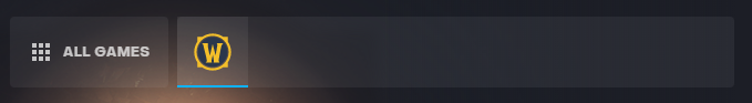
This bar is towards the top, it used to work down the left side of the launcher, and list every game. I just have it list the games I play, for me that is just World of Warcraft, so I don’t have icons lighting up for promotions etc like we did on the old launcher.
promotion? somehow seeing icons is disturbing? on a launcher? you don’t even have to click on them ever? Some people …
They used to glow or spawn pop ups. If you don’t find it annoying that’s fine, but I did. Just like the autoplay streams.
Awfully looking new launcher, give back the old one.
damn that new launcher is “hyper active”, where did the clean, nice simple launcher go 
I never got the new one it hasn’t arrived for me yet.
What would you put there instead? a gigantic play button?
The old one had just as much space taken up for news & updates.
I get everyone has an opinion but maybe you’re just being a stubborn old man (get it!?) not accepting change.
Me neither, unless I turn beta on. I’ve had beta on for months now so I just leave it on.
The new design is awful, its like being punched in the face by adverts and information but made by a 5 year old.
I can’t believe a team came together to improve and release something and came up with that crap. To think that meetings were held and people actually nodded and gave the thumbs up to that? Jesus Christ.
Yes and the biggest eyesore was Destiny 2 and all that Activision garbage i never cared for.
Why is it a problem if i don’t want to see the titles i won’t ever do anything with?
The new launcher to me looks like it follows ‘modern’ design paradigma, just wait another 10 years so they will think of something new that is deemed more ‘modern’.