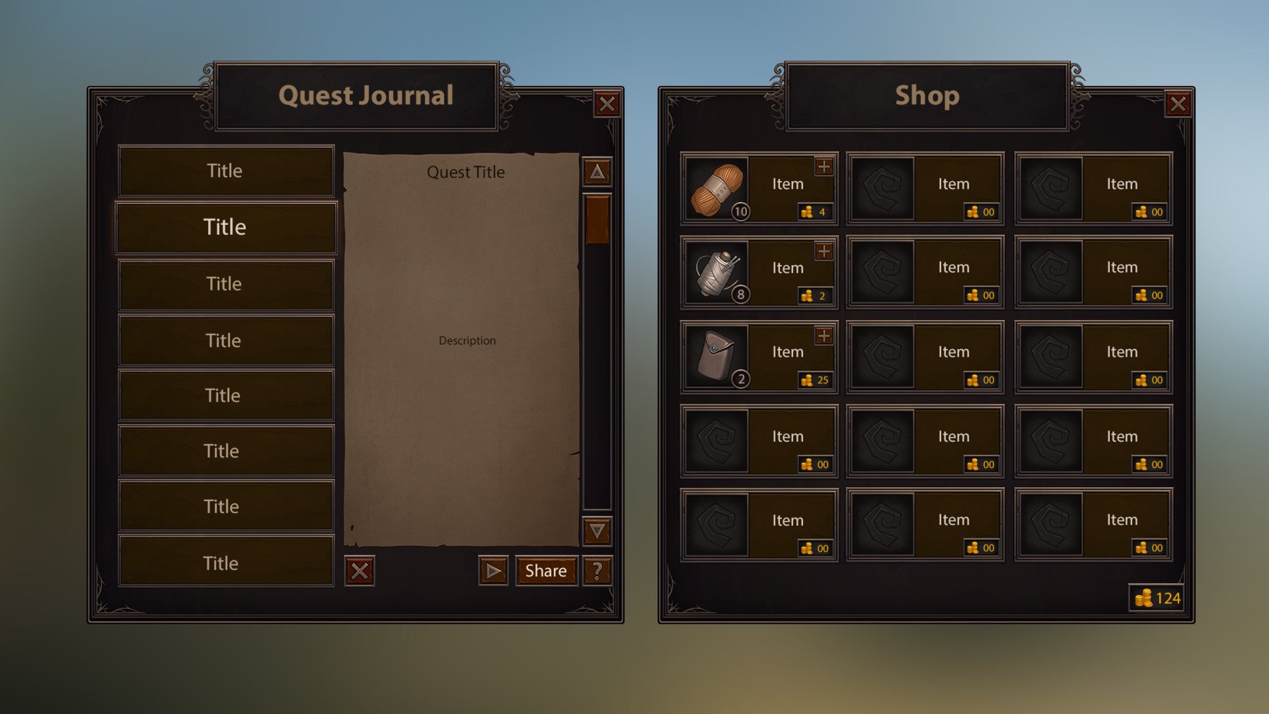
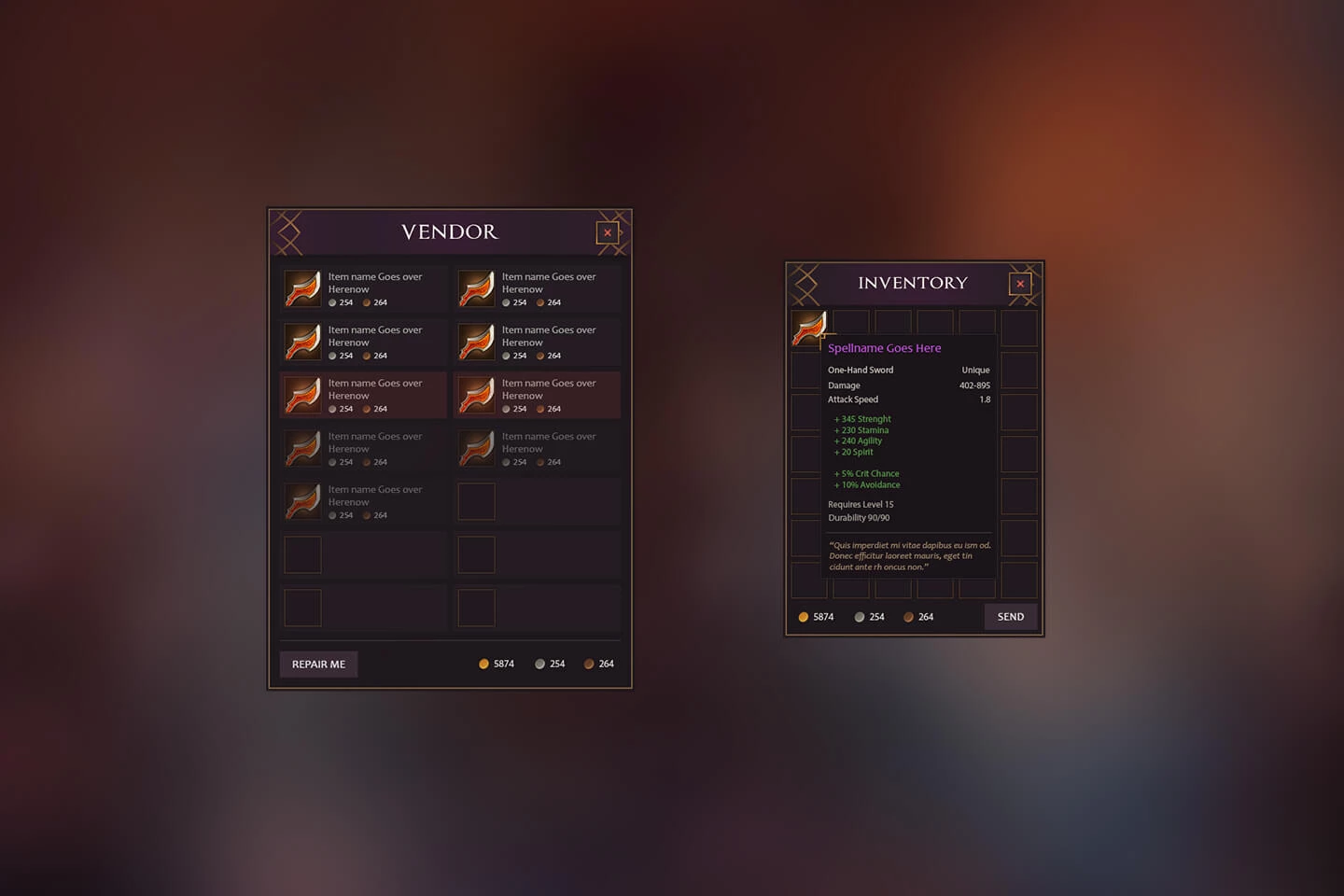
The vendor-window (you know, the one you see when opening the General Goods vendor for example) is beside the windows like talents, spellbook, etc… also a very important window that is used all the time. And that’s why I’m a little surprised that Blizzard doesn’t have an overhaul planned yet for the vendor window. It’s still the same window as 20 years ago and it got only some little tweaks over all the years.
What do you think? Should Blizzard overhaul this window and design a much better one?
Can’t say that I’m a fan of either window you mentioned. They’re…not really suiting? Big, inconvenient, the spell book magically stays small…and become big again, highlighted abilities don’t always make sense (as in…not missing, or when sky riding), your pending changes (talents) immediately get committed when clicking the hero talents (annoying), …
Those are actually examples of UX failures if you ask me.
I also hate the new spellbook. They said we are getting more UI customisation options in the future, hopefully that means we can resize the silly thing.
Yeah you just click on the number and type in how much you want. It is a little inconsistent though, sometimes it will only let you buy stacks of 20, other times up to 200, other times 1000… they definitely need to sort that.
I am thinking of a ton of quality of life improvements to make shopping at a vendor much better. Like:
Make the item box (item icon, name and price) wider so longer names fit better.
Add a 3rd column of items to view more at once.
Remove the pages and add a scrollbar with ‘infinite scrolling’-tech.
Add sorting option to sort by type, lowest/highest price, alphabetical order, etc…
Add a search-bar for specific item searching.
Add a shop filter (with a toggle to show/hide) and …
Move class filter there.
Add “show buyable only” to show only the items you got the currency for.
Add checkbox filters to show items with: “Gold prices”, “Special currency X”, “Special currency Y”, etc…
Add checkbox filters to show items that are: “weapons”, “armor”, “consumables”, “vanity”, “reagents”, etc…
Add filter options to show minimal item quality.
Add a dropdown option to your current currency box to show easily the other currencies you have that are used by the vendor.
Add a shopping basket feature so you can easily buy multiple items in one go. Including increase/decrease buttons at stackable items. At buyout it shows all the currencies you need to proceed.
I see no difference in the first two to what we already have. I prefer seeing the icons as we have in WoW than having to find it with the words in ESO.