IT’s like 5 minutes to make a UI.
Why ppl don’t like that?
It’s awesome and free space from addons!
2 Likes
This is what baffles me. It takes 5 minutes if that much to put the action bars and target frames, and whatnot like the previous UI - and you already have a Classic Preset which does most of it.
The 5 minutes people spend coming to the forums, loging in and making a moaning post can be applied on edit mode and put the interface the way they wanted to and it’s literally a one time thing as they can save the profile so they can use it right away on their alts. “ohh noooo I can’t spend 5 minutes looking at the options! it makes my fingers huuurt ![]()
![]()
![]() ”
”
There’s countles posts of people sharing their “Old ui” profiles, and even WoWhead has now shared one and stll people moan it takes too much work. I’m baffled at the reaction really
Old UI:
New UI:
Took me less than 5 minutes to set up. One time thing
1 Like
I’m really enjoying classic Wrath - started yesterday.
2 Likes
I like the configurable UI, but it’s very buggy at the moment. Raid style party frames don’t work in arenas (they just outright do not appear), sometimes after any loading screen frames don’t appear in the correct position on the screen, and so on. It will likely be fixed, and I am sure addons will appear that will give you the old layout anyway if you don’t like the new one.
Also, the party frames have no selector visual indication. That’s… not user friendly ![]() Also, thanks to the design of them, it’s unclear when you clicked the frame or not.
Also, thanks to the design of them, it’s unclear when you clicked the frame or not.
With a ![]() haha
haha
I’m starting to believe maybe the game isn’t acting the same to all people. The talent trees to me take the whole screen and have big letters and descriptions.
Here’s how it looks like to me:
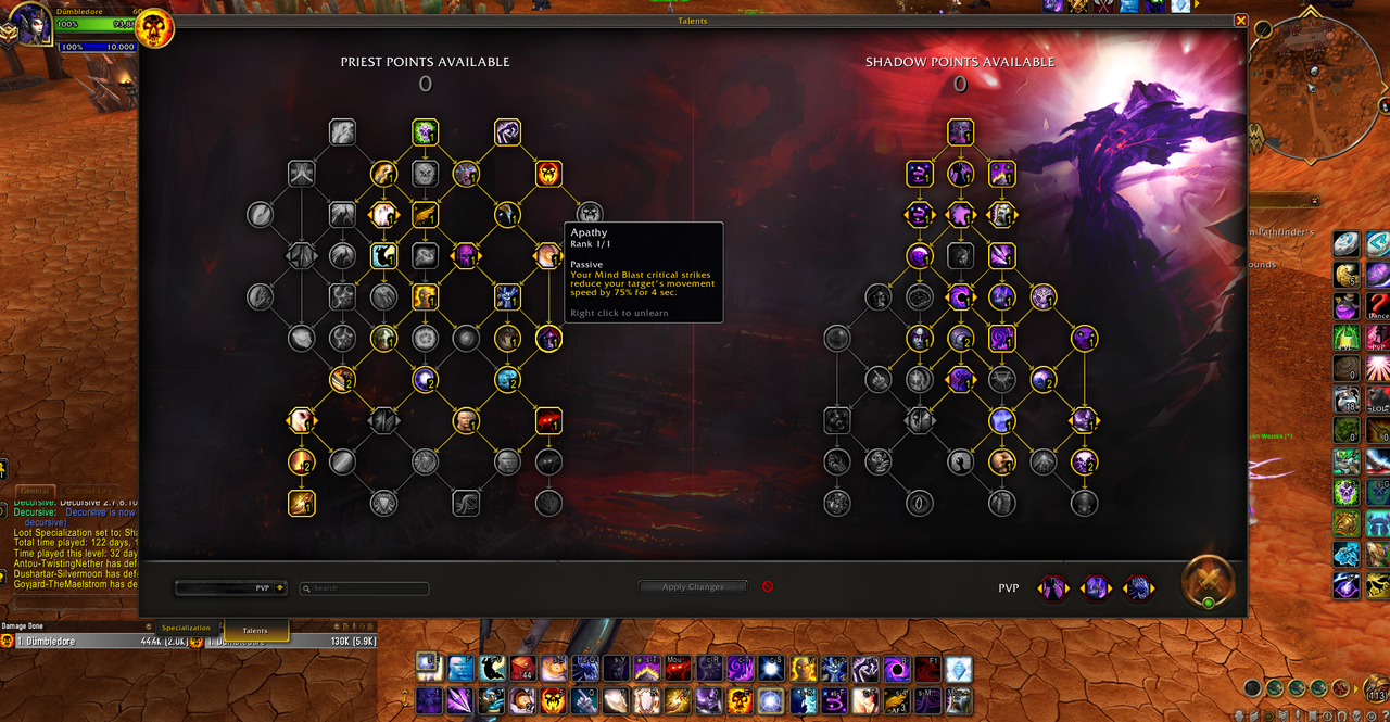
(click on the image to zoom to normal size):
I wonder if people have UI scaled down, therefore messing up the talent panel for them? Cuz to me it looks normal and huge
No matter what I do all the text there and on the actionbars is way too small and distorted. Hurts my eyes.
1 Like
Have you tried the UI scale options?
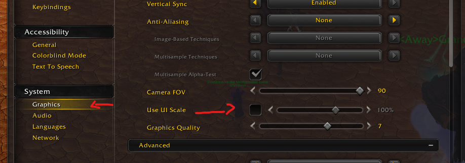
Mine is disabled and everything looks normal. In fact, in my UI I actually had to reduce action bar size to 90% in the options cuz they looked too big to me
deleted post
1 Like
Agree. I will just wait for an action bar addon to be updated.
Kind of harsh to say "nothing’ has colors when this is the only thing that doesn’t lol. I do wish they had the old colours so they would be easier to recognise though.
I’ve fiddled with the new UI a lot and while I don’t like change usually I’m managing to live with it so far.
2 Likes
I don’t dislike it, I was using Bartender previously and will give it a go, I have set up a different UI based on each of my 60’s so far but will probably play around with it more, I am not trying to get it looking anywhere near the classic look as that was horrible anyway, I do like that buffs/debuffs can now be moved into line of sight instead of stuck up the top where your natural eye line is not during combat, Its a little annoying the spell book and bags can not be dragged around the screen when open as if you place for example an action bar on the left when you open spell book to put anything in it you can`t as the spell book covers it. I think overall its better than what there was, allowing some elements that were unmovable to now be moved.
1 Like
I prefer the positioning flexibility of the new UI, it is only the bottom right micro icons which could be a little bit bigger for clicking (as I reassigned some of those keybinds). The mouse hovering text labels help a lot atm.
The bar (now under the map) has tiny text, but so far I have only been able to increase chat text size, still looking for the adjustment option.
I will check my scaling, but all the other stuff is reasonably sized. Will continue experimenting and see what can be done.
1 Like
Blizz tried and failed horribly at ripping off Bartender addon, that was bad from the start anyway.
ElvUI is the only thing that makes this game playable, too bad that addon is broken as well atm…
4 Likes
I just want to have option where i can choose to have this new ui or the one and only that i like original ui.
4 Likes
There will always be people that will push back against change. Nothing new. IMO the new UI is a step up, still needs more features though. Still can’t move the map, character and quest windows. So ridiculous.
Nah, man. They are complaining for the sake of complaining. Do not bother yourself
Jeez louise, you’re such a doomsayer…
I would appreciate some tweaks, but it’s pretty good as it is.
I’ve always played this game without any major UI addon just fine and it’ll continue to be this way. I’m glad they’re trying something to keep the game relevant. It differentiates it more from Classic now too.
1 Like
They should make “classic lookalike” to be default, as it seems that some people are struggling with customizing.
4 Likes
I liked the old UI and I wish there was a “use legacy UI” parameter. Oh well
5 Likes